IBM i Modernization - The User Interface
(Part 10)
This piece continues the topic of web user interfaces in which the layout automatically adjusts to a variety of device types and screen sizes (i.e. cell phones, tablets, laptops, and desktops) and screen orientations (portrait and landscape).
Part 9 showed a set of screen shots of an application wherein the layout automatically adapts to desktop, laptop, tablet, and cell phone screens.
Click on the following image to demonstrate the application in a new tab or window. Use arrowUp and arrowDown keys (if available) to navigate the list. I'd like to review the pertinent HTML, CSS, and JavaScript after you've had an opportunity try the UI.
Meta Tag
The first tip in designing pages that are "responsive" to various screen sizes and device types is to place the following meta tag in the page's heading block. It instructs browsers to automatically scale the size of content on cell phones and tablets so that it appears comparable to that on desktop monitors.
Cell phones and tablets have higher pixel densities per inch that traditionally make text appear small in comparison to desktop monitors. Prior to the availability of this meta tag, web designers would use CSS scaling in order to make text more readable without magnification on small devices. This meta tag solves that problem without the use of CSS hacks.
The Body
The body of the HTML page is as follows:
<div class="app">
<div class="tabs" id="tabs">
<a id="t1" href="#list" onClick="sel_tab(1)" style="width:50">List</a>
<a id="t2" href="#detail" onClick="sel_tab(2)" style="width:50">Detail</a>
<span id="titll" style="padding-left:20; width:190; word-wrap:break-word; display:inline-block"></span>
</div>
<div ht-container="list" ht-href="ibmiui10a.html" ht-jref="empty.json" ht-cache ht-after="after_list()" style="max-width:1040" id="dl"></div>
<div ht-container="detail" ht-href="ibmiui10c.html" ht-cache ht-after="after_detail()" style="max-width:1040"></div>
</div>
</body>
The body consists of the following parts:
- a <div> container for the application.
- a <div> container for tabs.
- 2 <a> tags are used for "List" and "Detail" tabs.
- a <span> tag is used to display course descriptions as users navigate the list.
- a <div> container for the list content.
- a <div> container for the detail content.
The win_resize() handler is triggered when the browser window is resized. It runs code that adjusts the height of list and detail containers in order to support scrolling underneath tabs and table headings.
This application uses a utility that "merges" additional HTML and JSON content that is requested from an IBM i server at runtime in order to populate the List and Detail containers. That utility was delineated in Parts 6-8.
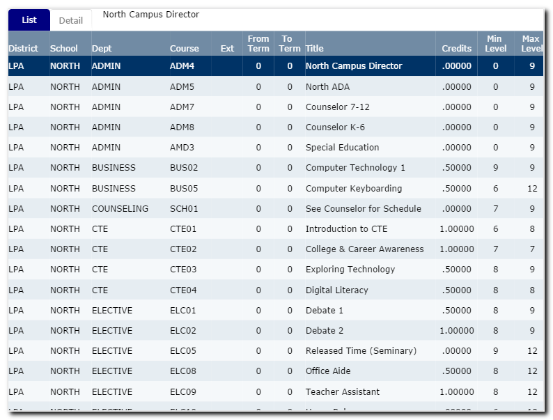
Table Headings
The following HTML template ibmiui10a.html is merged into the List container at runtime and shows the layout of column headings.
<tr>
<td width="80">District</td>
<td width="80">School</td>
<td width="150">Dept</td>
<td width="80">Course</td>
<td width="60" align="center">Ext</td>
<td width="60" align="center">From Term</td>
<td width="60" align="center">To Term</td>
<td width="250">Title</td>
<td width="80" align="center">Credits</td>
<td width="70" align="center">Min Level</td>
<td width="70" align="center">Max Level</td>
</tr>
</table>
<div id="dr" class="scroll" style="width:1058">
<table ht-container="courses" ht-href="ibmiui10b.html" ht-jref="ibmiui10.json" ht-repeat ht-cache ht-after="after_rows()" width="1040" id="tb" cellpadding="0" cellspacing="0" border="0">
</table>
</div>
Table Rows
The following HTML template ibmiui10b.html is merged with ibmiui10.json to populate the table rows.
<td width="80" class="grid">{{DISTRICT}}</td>
<td width="80">{{SCHOOL}}</td>
<td width="150">{{DEPT}}</td>
<td width="80">{{COURSE}}</td>
<td width="60" align="center">{{EXTENSION}}</td>
<td width="60" align="center">{{TERMFROM}}</td>
<td width="60" align="center">{{TERMTO}}</td>
<td width="250">{{TITLL}}</td>
<td width="80" align="center">{{CREDITS}}</td>
<td width="70" align="center">{{MINLEVEL}}</td>
<td width="70" align="center">{{MAXLEVEL}}</td>
</tr>
Detail
The detail container is populated at runtime by merging ibmiui10c.html with the selected JSON array item when the Detail tab is selected.
Let's review the following HTML excerpt.
<div class="il w2 label">Long Title</div>
<div class="il w2"><input disabled name="TITLL" value="{{TITLL}}" size="50"></div>
</div>
Up to this point I haven't explained much about how to design pages that are adaptable (responsive) to various screen sizes and device types. Note that field labels and input elements are grouped together and surrounded by <div> containers that have relevant CSS class names.
CSS Tips
Let's review the properties of the "il", "fl", and "w2" CSS class names.
.il {
display:inline-block;
}
.fl {
float:left;
}
.w2 {
width:180;
}
The "li" class overrides the default way that <div> containers are displayed and allows them to flow horizontally across the page.
The "fl" class allows elements to float from left to right until a "width" limit is reached - then wrap underneath and back to the left.
The "w2" class specifies a width of 180 pixels. Since it applies to <div> tags that encapsulate field labels, that makes all field labels occupy the same amount of width that creates a columnar (or grid) effect on wide screens, and places labels above input elements on narrow screens (i.e. cell phone portrait viewing).
Grid Systems
Popular responsive CSS frameworks implement a concept that is often referred to as a "grid system", entailing from hundreds to thousands of lines of code for CSS class definitions, and JavaScript. They often entail separate sets of CSS class names for extra-small, small, medium, and wide screens.
In my opinion, page designers can achieve better "responsive" effects, more simply by using a combination of say "il", "fl", and "w(n)" class definitions, where the (n) represents a number from say 1-12, and specifies widths that range from say 90-1080 pixels.
With grid systems, web page designers are often fighting with complexities and unknowns within the frameworks.
Container Height and Vertical Scrolling
When tabs and tables are employed in database maintenance applications, usability is enhanced when tabs and table columns remain fixed while other content (i.e. rows, data-entry forms) scroll vertically underneath. This can be achieved with a small amount of CSS and JavaScript.
The following CSS class enables scrolling within <div> containers.
overflow:auto;
-webkit-overflow-scrolling: touch;
-webkit-transform: translateZ(0);
}
Which works when paired with a JavaScript routine that adjusts the height of scrollable <div> containers when users expand or shrink browser windows.
dl.style.height = dl.parentElement.clientHeight - dl.offsetTop - 48;
dr.style.height = dl.style.height;
if (dd) dd.style.height = dl.parentElement.clientHeight - dl.offsetTop;
}
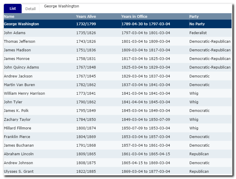
U.S. Presidents
I created the course-list application in order to provide a basis for sharing tips about responsive design. The application lacks a lot of features in its present condition. It could be functionally expanded in order to provide a basis for basic database maintenance.
After the template was set and vetted, it only took a few minutes to adapt it to another JSON array (U.S. Presidents):
In a future article I intend on addressing how application templates can be transformed into what I like to call "application models", which trivializes the amount of custom coding required, and which can be applied to all kinds of database entities.