IBM i Modernization - The User Interface
(Part 9)
This article delves into the creation of web user interfaces in which the layout automatically adapts to a variety of device types and screen sizes (i.e. cell phones, tablets, laptops, and desktops).
This topic is commonly referred to as "responsive design". A vigorous ecosystem has erupted, including dozens of popular CSS and JavaScript frameworks that focus on addressing this concern.
The motivation should be obvious - the resources, requirements, and cost of creating and maintaining separate web sites and applications for separate device types is generally prohibitive. Web browsing via cell phones and tablets now exceeds that of laptop and desktop systems.
IBM i modernization tools that extend the green-screen paradigm almost always fail in regards to automatically adapting page layout in response to client device sizes.
This piece builds on articles that precede it.
Responsive Design and Frameworks
Learning responsive design and adapting allied frameworks to database applications can be a challenge:
- The variety and volume of information and resources available on the internet is enormous (a blessing and a curse).
- Much of the information is promotional.
- Available information and means are typically geared to the requirements of news, text, media, and brochure-style content rather than database applications.
- The fitness of much of the information is poor (too many examples to list - as the user experience often deteriorates measurably between different device types).
- Promulgated ideas and frameworks tend to be ill-suited for database applications. They also tend to be overly-sized, overly-scoped, and complex.
Requirements of Database Management Applications
Database inquiry and maintenance by and large is about working with tables (lists of rows), individual records, data-entry forms and widgets.
I'd like to share a number of traits that should be "responsive" to diverse device types and screen sizes. Layout should also automatically adapt to portrait and landscape viewing.
In regards to viewing nearly ALL content on small devices:
- UI component and character sizes should be readable (not tiny).
- Users should be able to (but not required to) magnify.
In regards to reading fluid text via small devices:
- Users should not be required to pan (or scroll) from side to side in order to see it.
- Text should wrap at screen width and flow from top to bottom.
- Line length should adapt to screen width.
In regards to viewing tabular data:
- Column headings should remain fixed while rows should scroll (or pan vertically) beneath them.
- Some frameworks truncate (remove) right-hand columns on small devices. However, in my opinion, the value of viewing cohesive tables generally exceeds the value of fitting tables to available width; It's okay for users to pan left to right in order to view fixed-width columnar data.
- However, users should not be required to pan to see the contents of individual columns - column data should line-wrap vertically if necessary to fit screen width.
In regards to full-record viewing and data entry forms:
- UI components by default should automatically flow left to right (or visa versa) and vertically in order to fit within screen width.
- When field labels are paired with input elements, they should remain together as components flow horizontally and vertically.
- Push buttons (i.e. for submitting data) should be sized appropriately for cell phones, as well as desktop monitors (users may have fat fingers ;-).
- Images and other UI widgets (i.e. text areas) by default should automatically resize in order to fit within screen width and height.
Form Examples
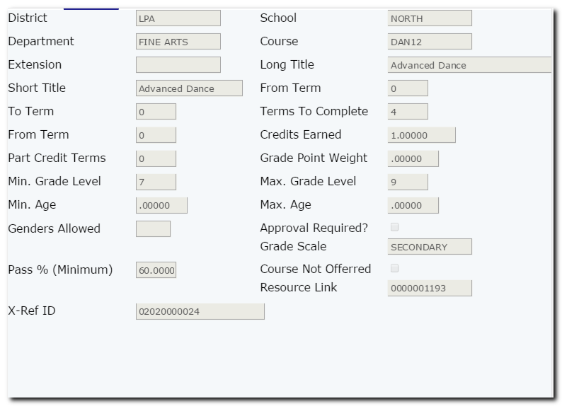
The following images depict how form components might automatically flow depending on whether viewed on an iPad, or an iPhone 4.
iPad landscape:
iPhone 4 portrait:
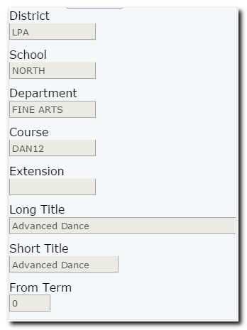
Note that the iPad landscape view separates field labels and input elements into 4 columns horizontally, while the iPhone portrait view separates field labels and input elements vertically within a single column; users pan vertically to see additional input elements.
On a wide-screen monitor, the layout may shift and expand horizontally into 6 columns, as opposed to 4 columns on the iPad.
Note that the font sizes appear the same, no matter the screen size or resolution (pixels per inch).
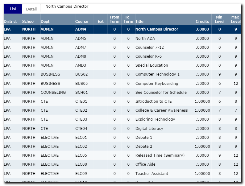
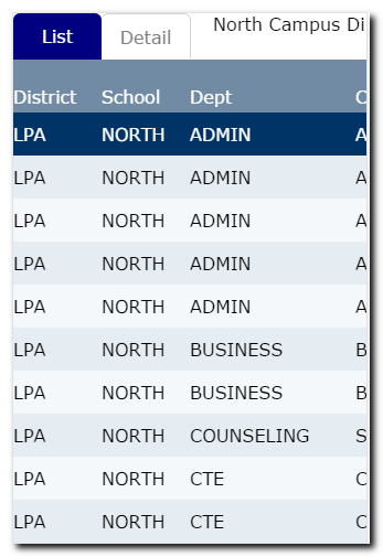
Table Examples
The following images depict how table components might automatically flow depending on whether viewed on an iPad, or an iPhone 4.
iPad landscape:
iPhone 4 portrait:
iPhone 4 landscape:
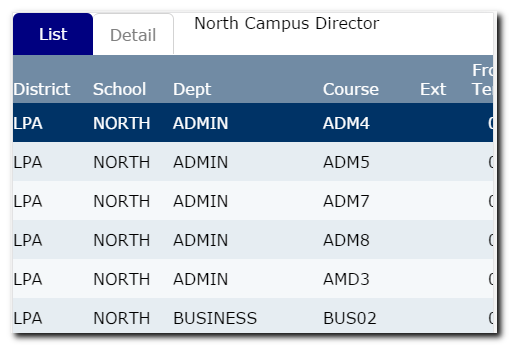
Note that although tables may be truncated on the right side due to small screen size, headings are fixed while rows may be scrolled, so row and column contexts are preserved.
Users may optionally reduce magnify, and view all columns on small screens when desired. But the default look and feel should accommodate readability and usability (i.e. selecting a row with a finger tap, and panning vertically with finger swipes).
What to Look For Next
Responsive traits (how page layouts adjust automatically according to device type and screen size) is determined by HTML element groupings, CSS styling, and possibly a small amount of JavaScript. Some web designers accomplish this with frameworks.
In the next article, I intend to demonstrate and review the application shown in screen shots in this piece, including an explanation behind the HTML, CSS, and JavaScript code.